


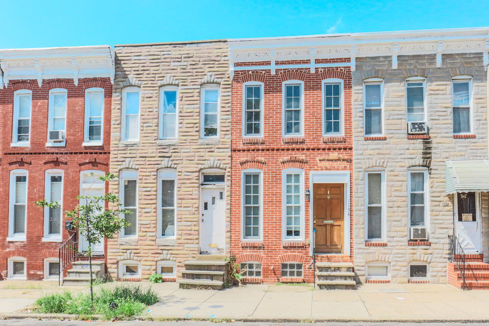
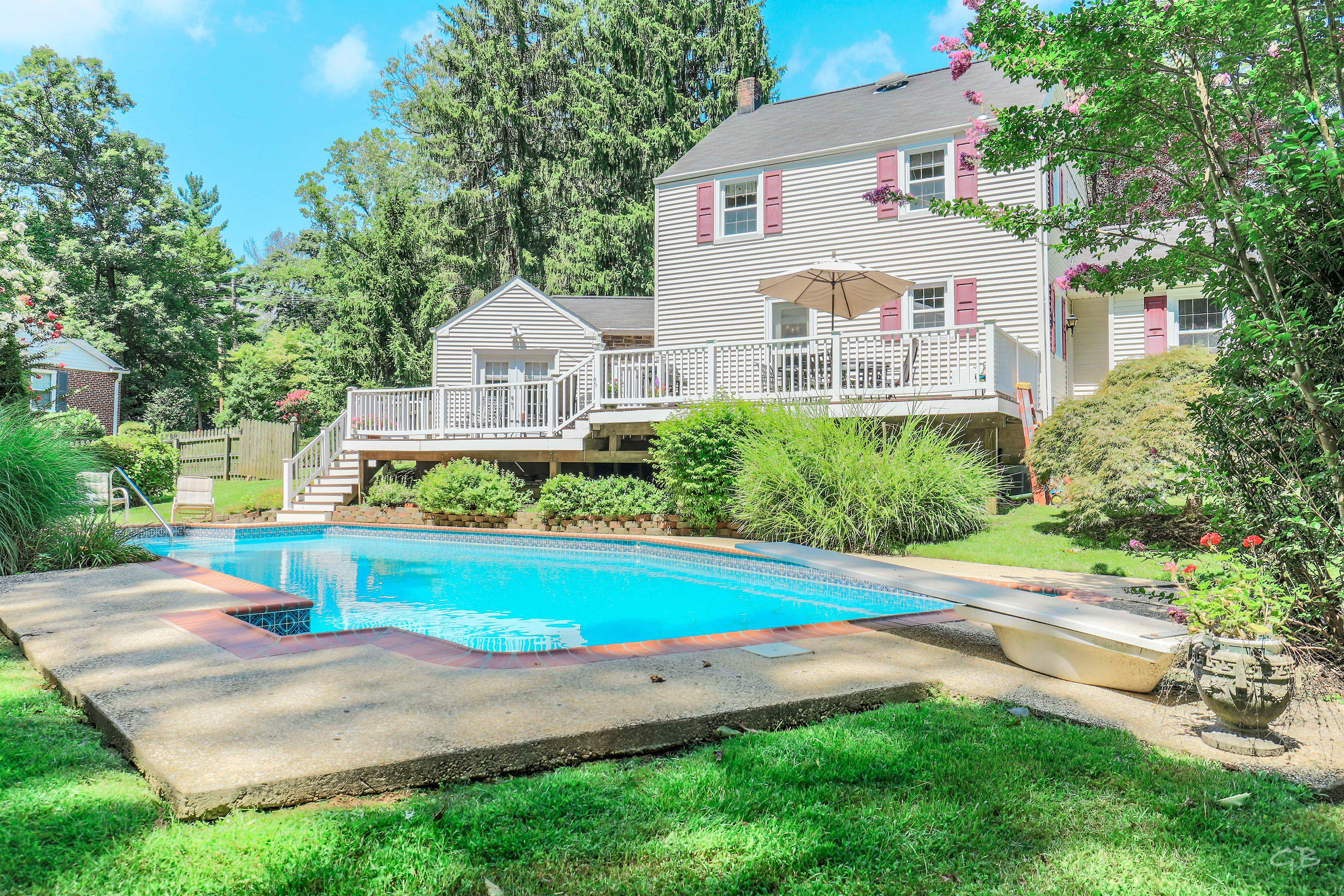

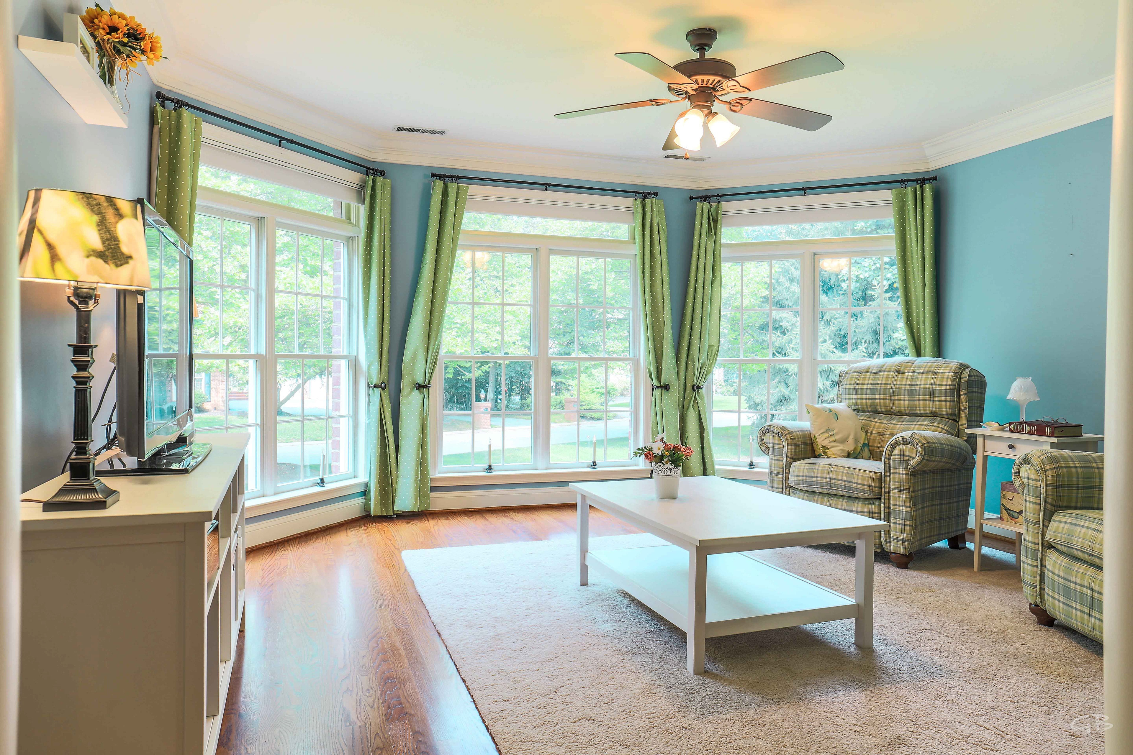
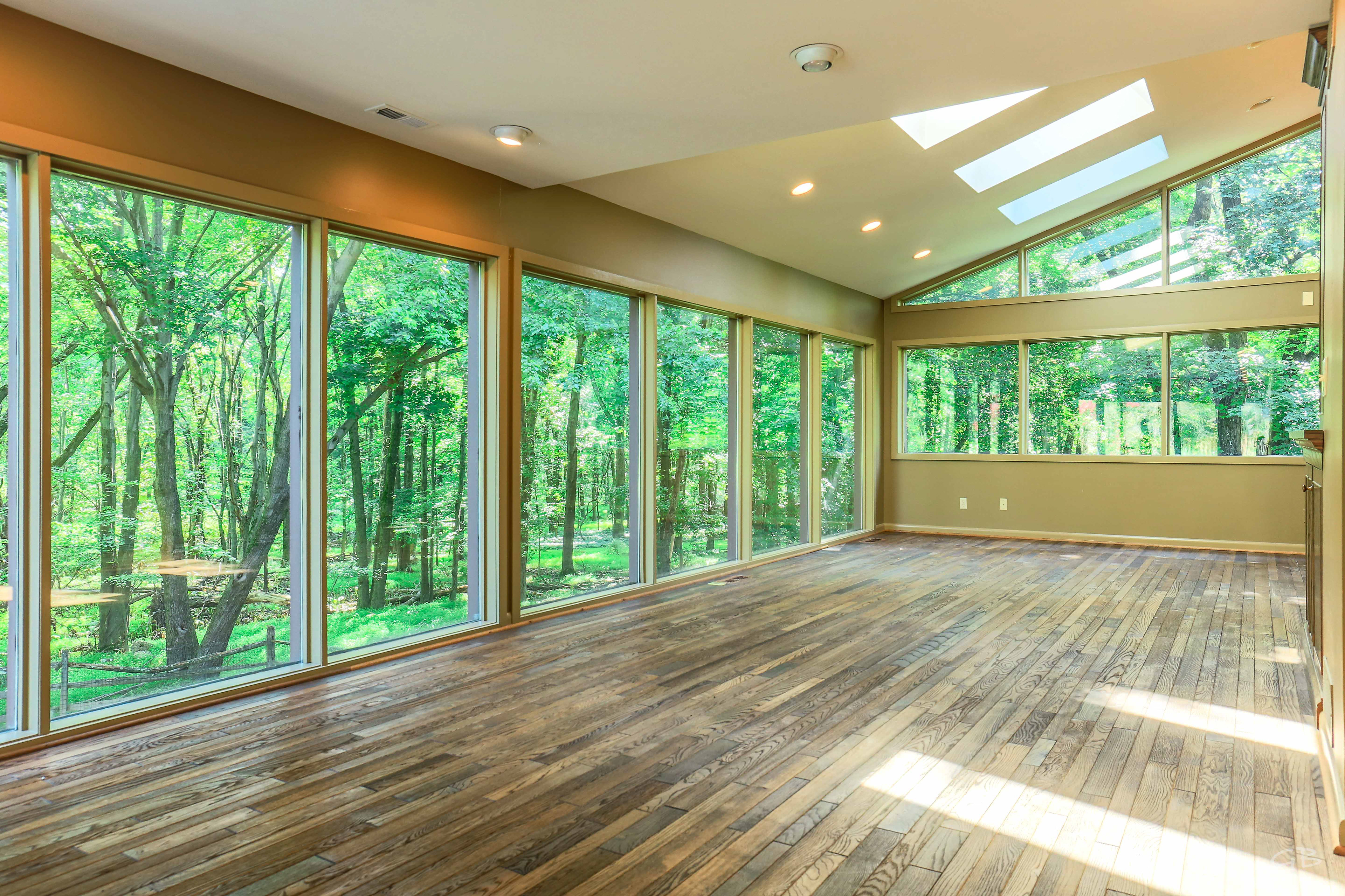
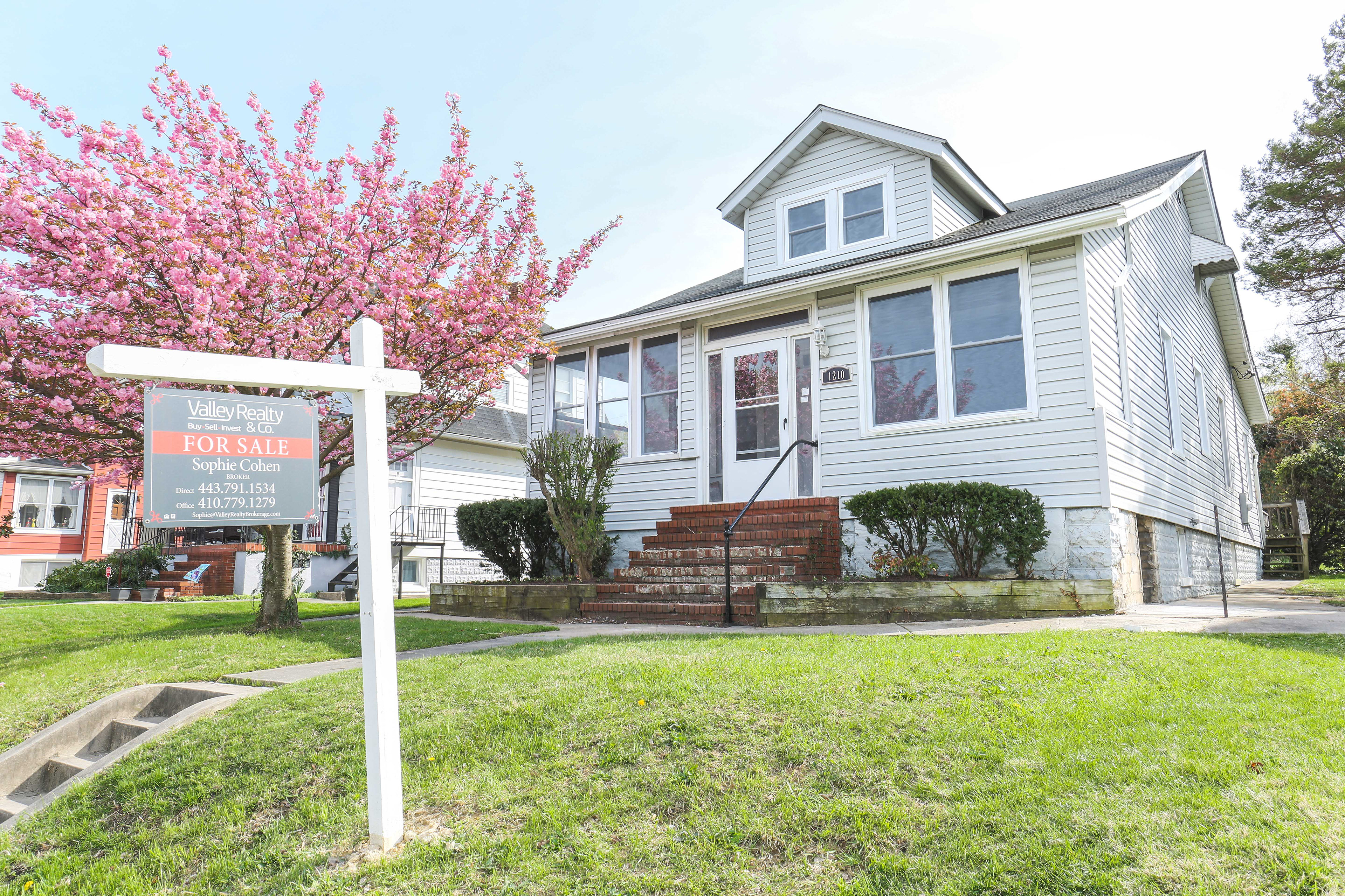
CLIENTS: I have the pleasure of working with Real Estate Agents, Architects, Interior Designers, GC's, Investors, and Commercial/Residential Property Owners to promote the sales of their businesses & properties by providing them with Next Level mandatory marketing materials.
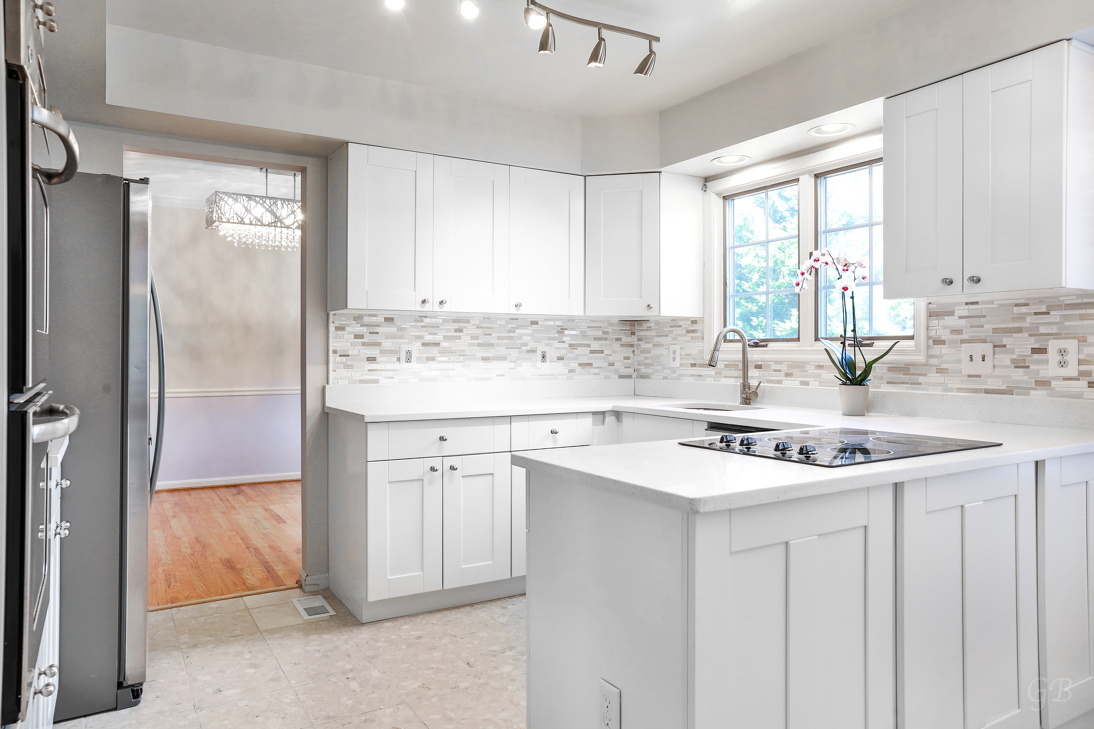
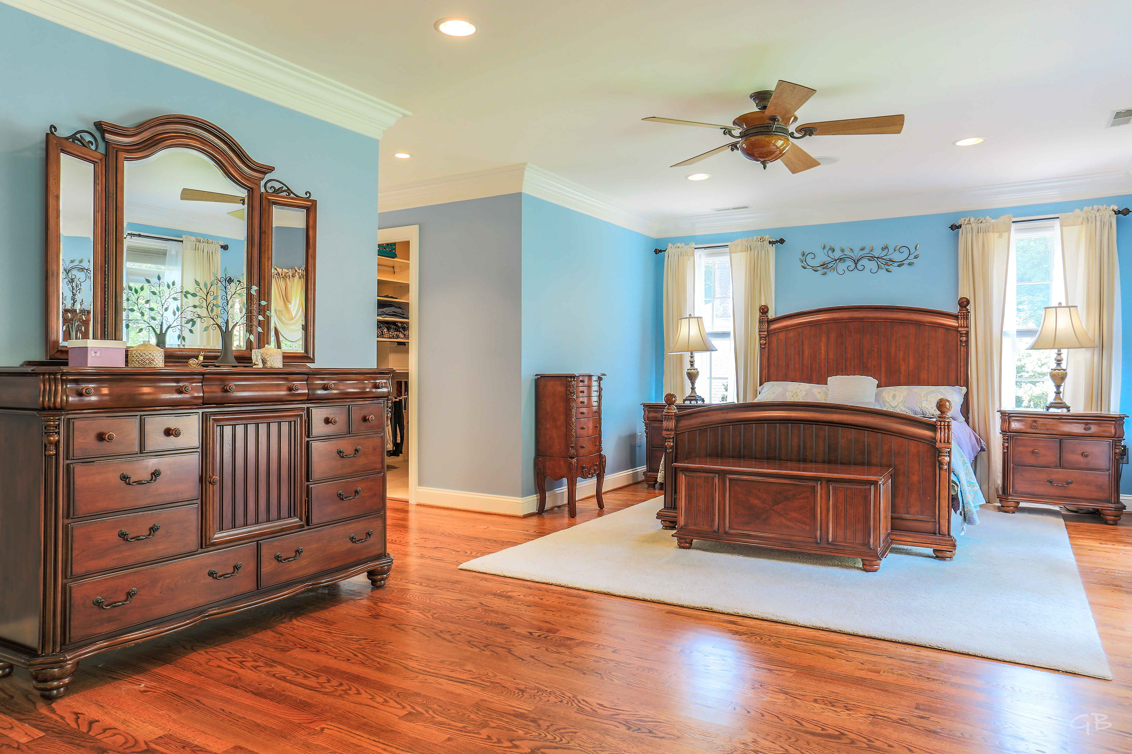
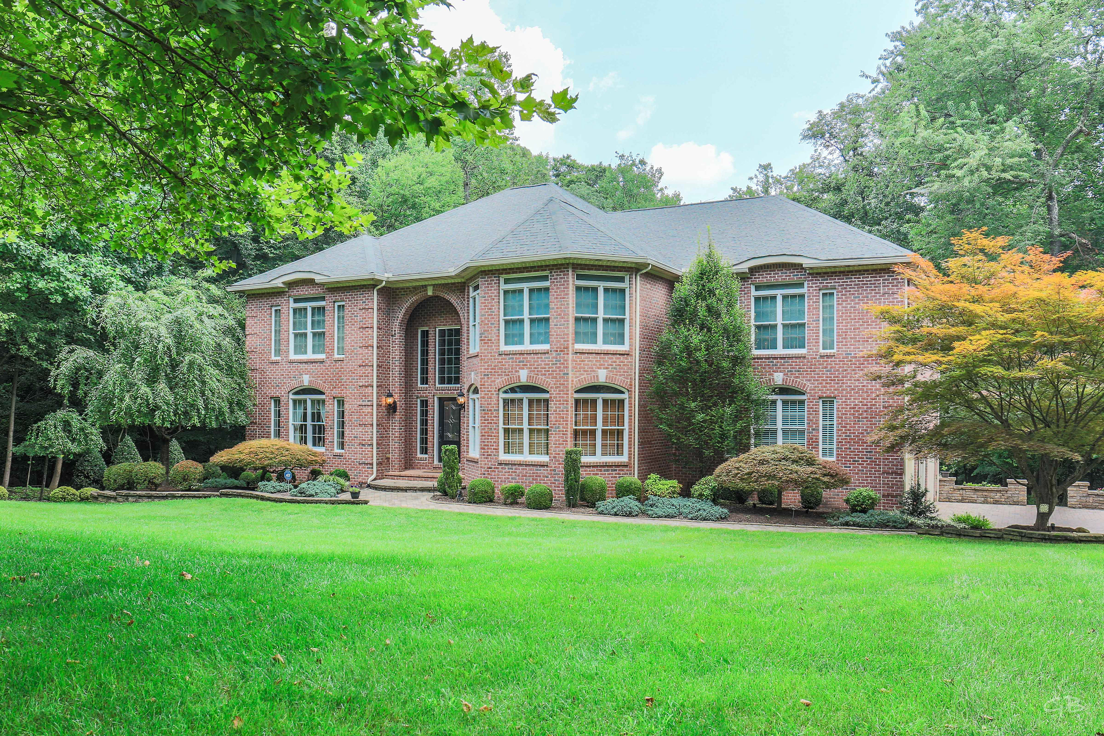
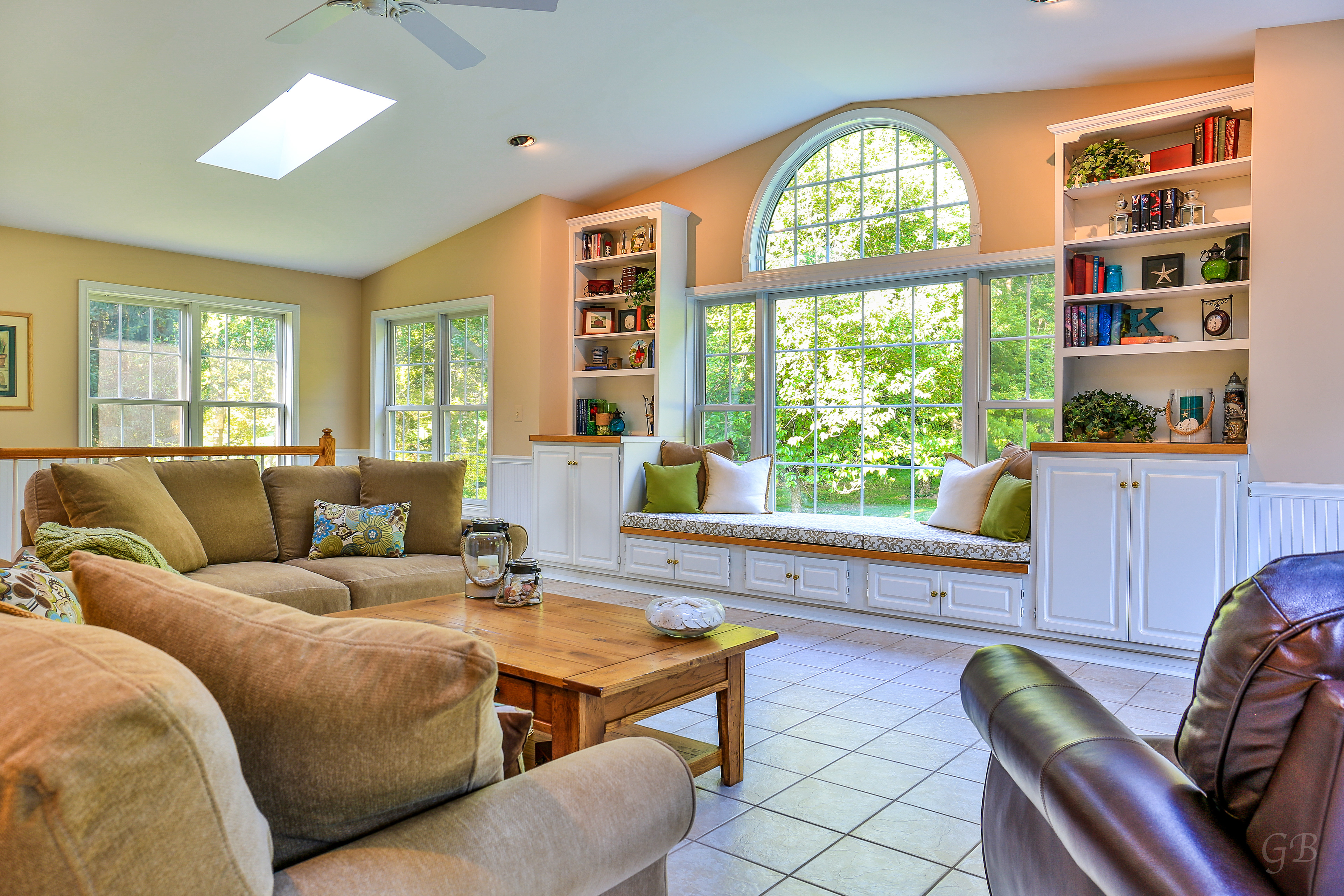
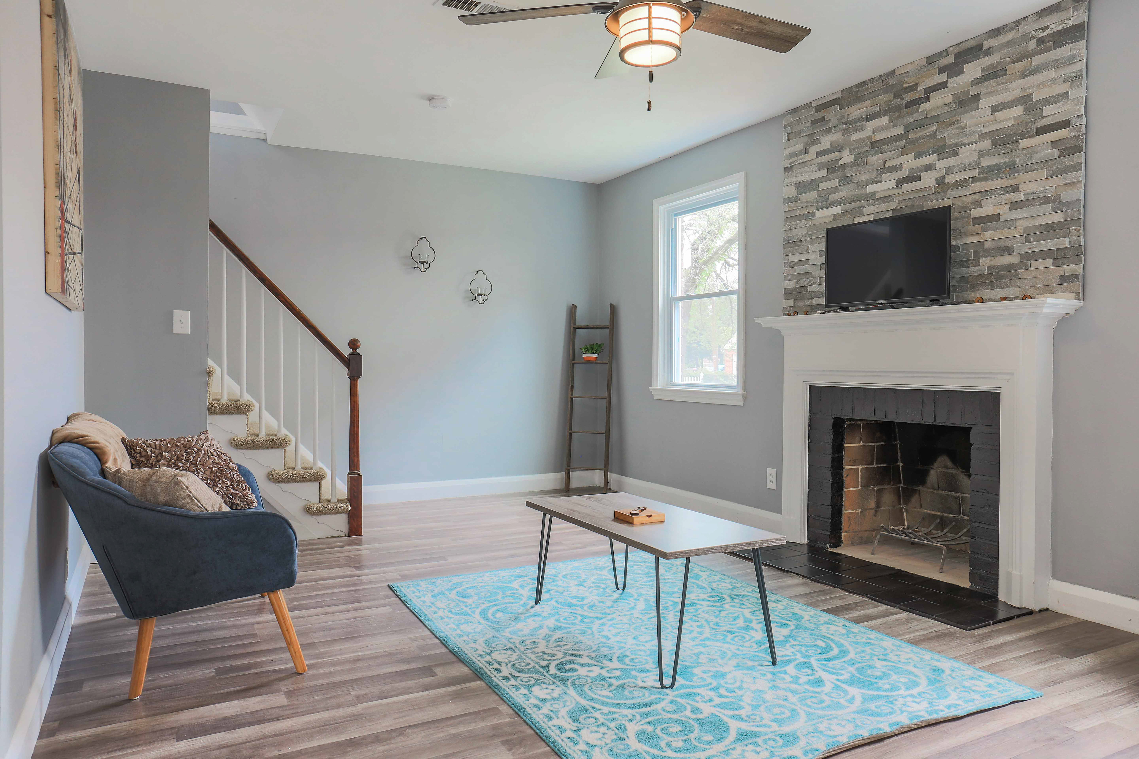
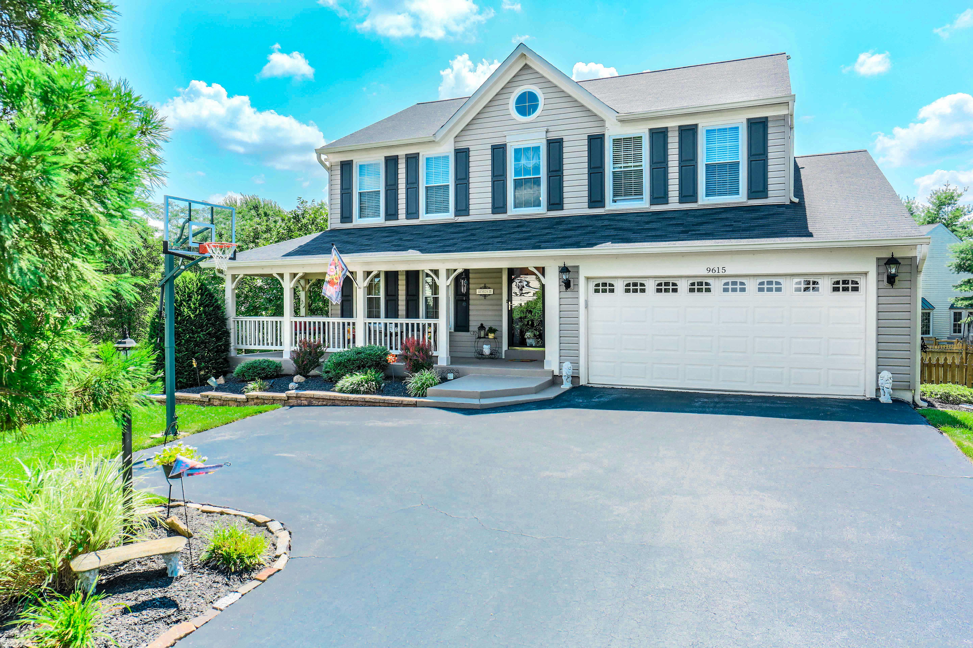
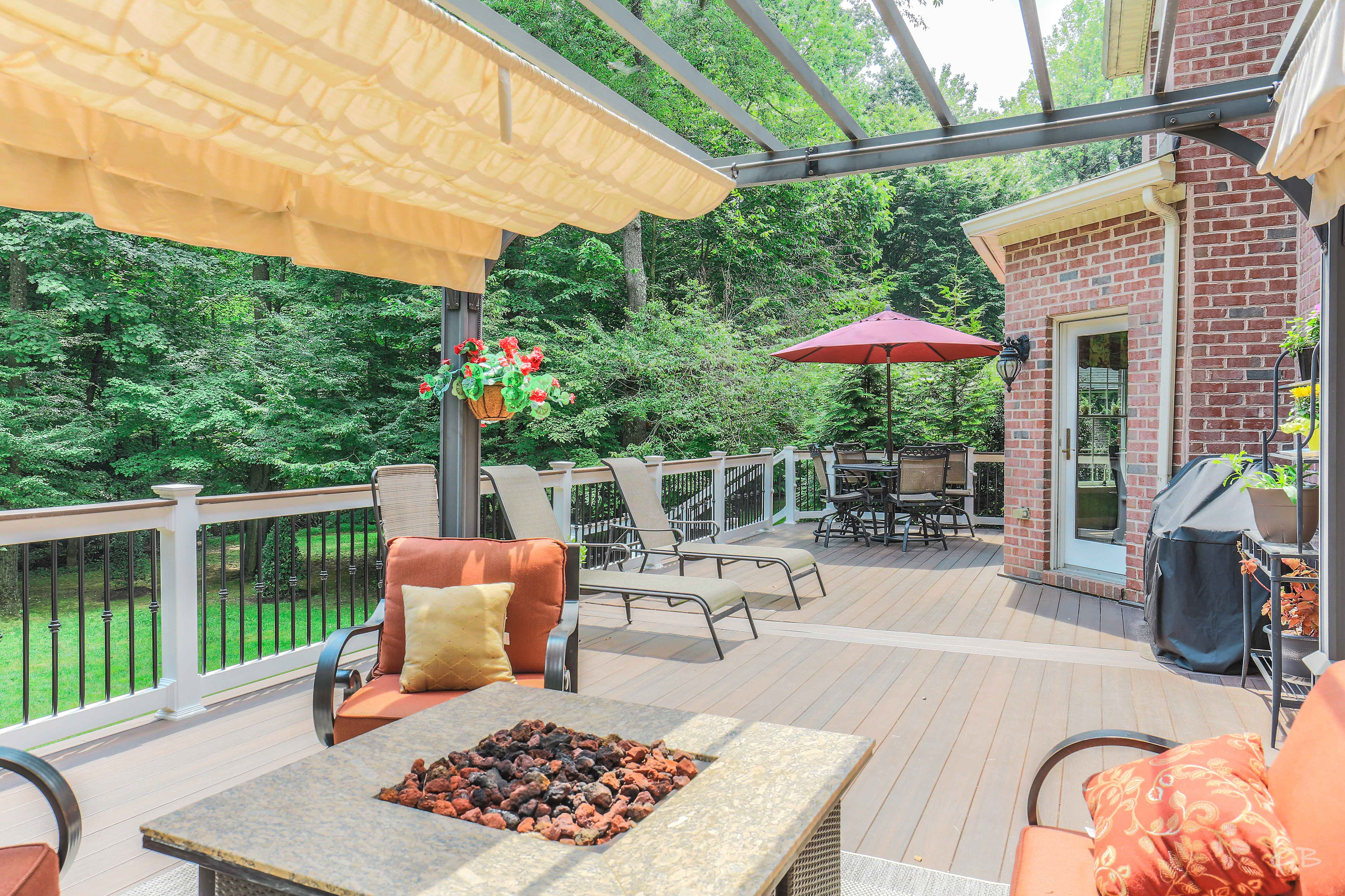
STYLE: Utilizing Natural Light HDR Photography & a Realistic Wide Angle Lens, I capture each property truthfully while highlighting the beautiful touches all around. In this way, I assist to increase Trust between Agents & Clients, & streamline interactions, saving Valuable Time for each party Involved. No more, "Hmm... This looked bigger in the photos." Your clients won't be mislead, instead they will feel a greater level of Satisfaction when interacting with you. Honesty, Trust, & Quality Photos help Sell Fast!
PHOTOSHOOTS: Utilizing Industry Standard 'Leveling' for Setup, each shoot lasts 1-2 hours as I walk through creatively documenting the entire location. Providing 1+ High Quality JPEG Images/Photos for every room, I also White Balance, Color Correct, & Post Image Enhance every photo - for that extra POP - to help your listing Stand Out and Sell Quick!
The Power of White Balance, Color Correction, & Post Image Enhancement.
In a Pinch?
Top Tips to Taking Your Own Photos!
Taking property photos doesn't have to be stressful. Remove any worry and get the shots you need by following these simple instructions.
Topics
1. Lights & Ceiling Fans
1. Lights & Ceiling Fans
2. Blinds & Windows
3. Quick Staging
4. Taking the Shot
5. Shooting Outside
6. Final Touches
3. Quick Staging
4. Taking the Shot
5. Shooting Outside
6. Final Touches
1. Lights & Ceiling Fans
Fill the property up with light and abundance! Make sure to TURN ON all the lights in the house; this includes stove top lights, bedside lamps, and any additional accent lighting. The brighter it is the more welcoming, so let that baby shine! While you're at it, remember to turn off all the ceiling fans so there's no distracting Motion Blur in the final images. Perfect!
*** Place Cursor/Finger Over Images for Additional Notes ***

Lamp Lights Accent the Room

Overhead Light Fills the Room
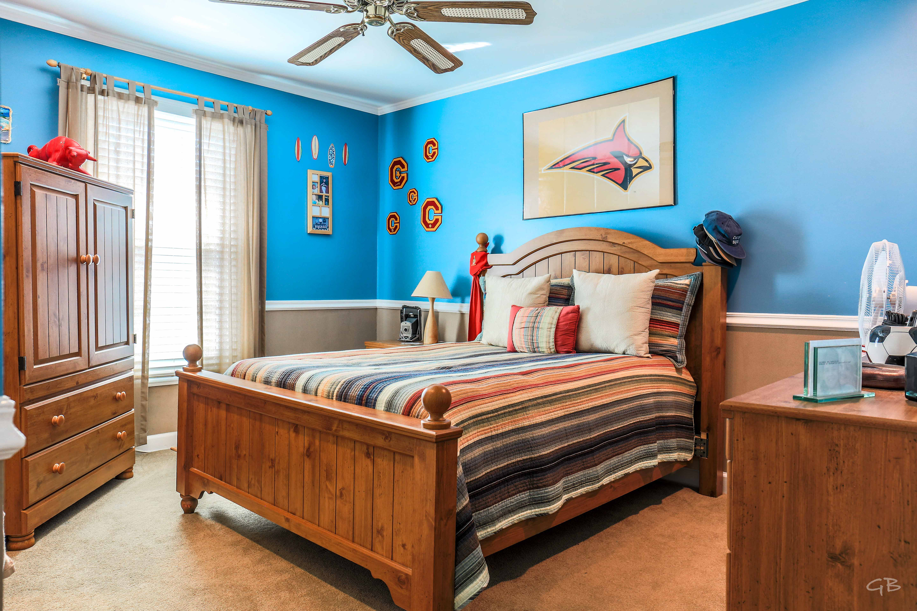
No Distracting Fan Motion Blur
2. Blinds & Windows
Depending on the direction of the Sun, put the blinds down full or half way and open them to a 45 degree angle. This allows the light beams to stream in across the floor, brightening the space even further while filtering the sunlight so the windows aren't 'blown out', which can pull focus away from the image as a whole. There are of course exceptions to this rule if you're looking for that specific glow. In certain scenarios though, there aren't any blinds, so use your best judgement. Of course when you're in quick pinch, blown out windows aren't going to make or break the image. Though maybe wait for a cloudy day, or take photos when the sun is overhead (not recommended for when shooting outside). The point is be intentional with the amount of natural light. You got this!
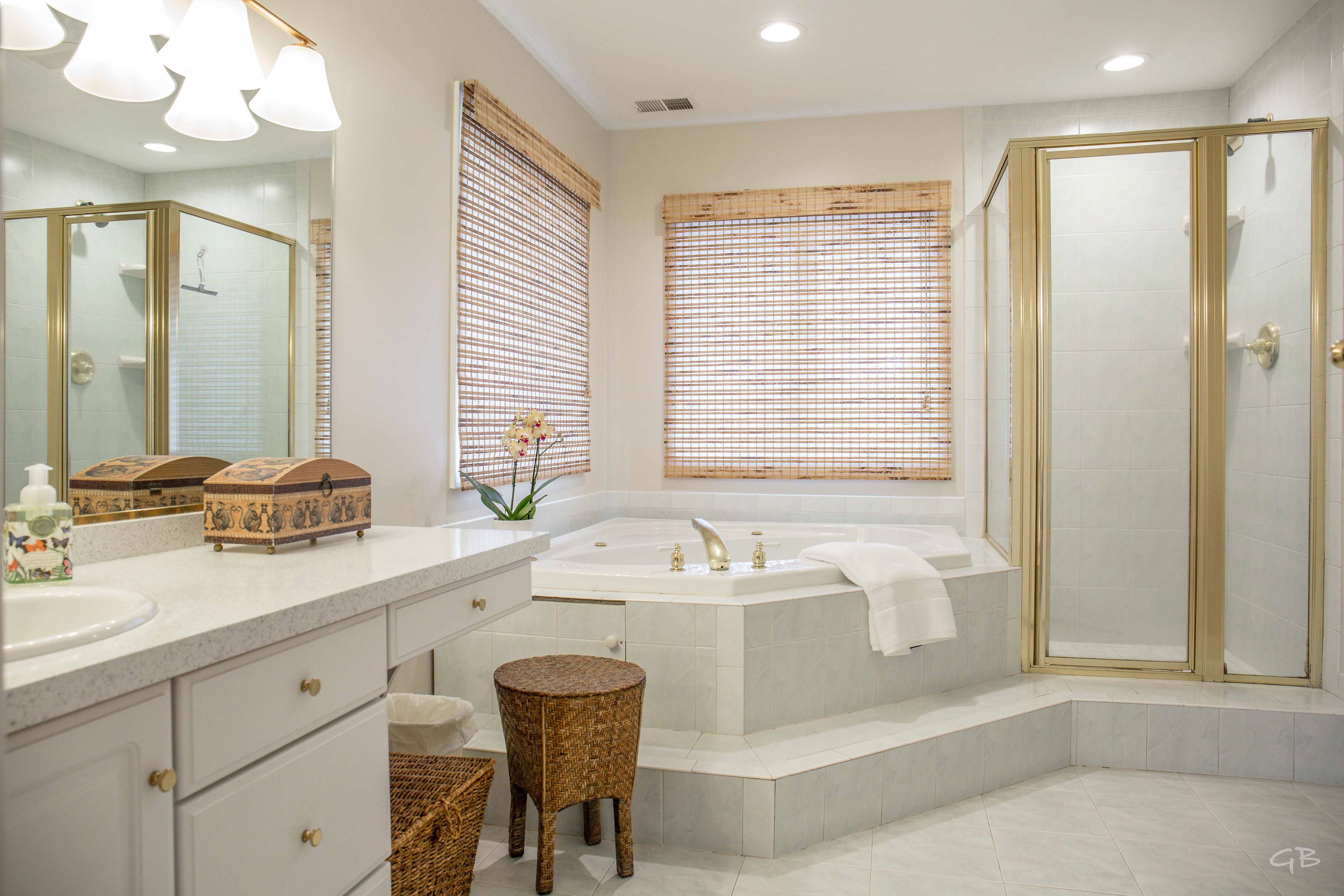
Blinds Down.

Shaded Tree Coverage.
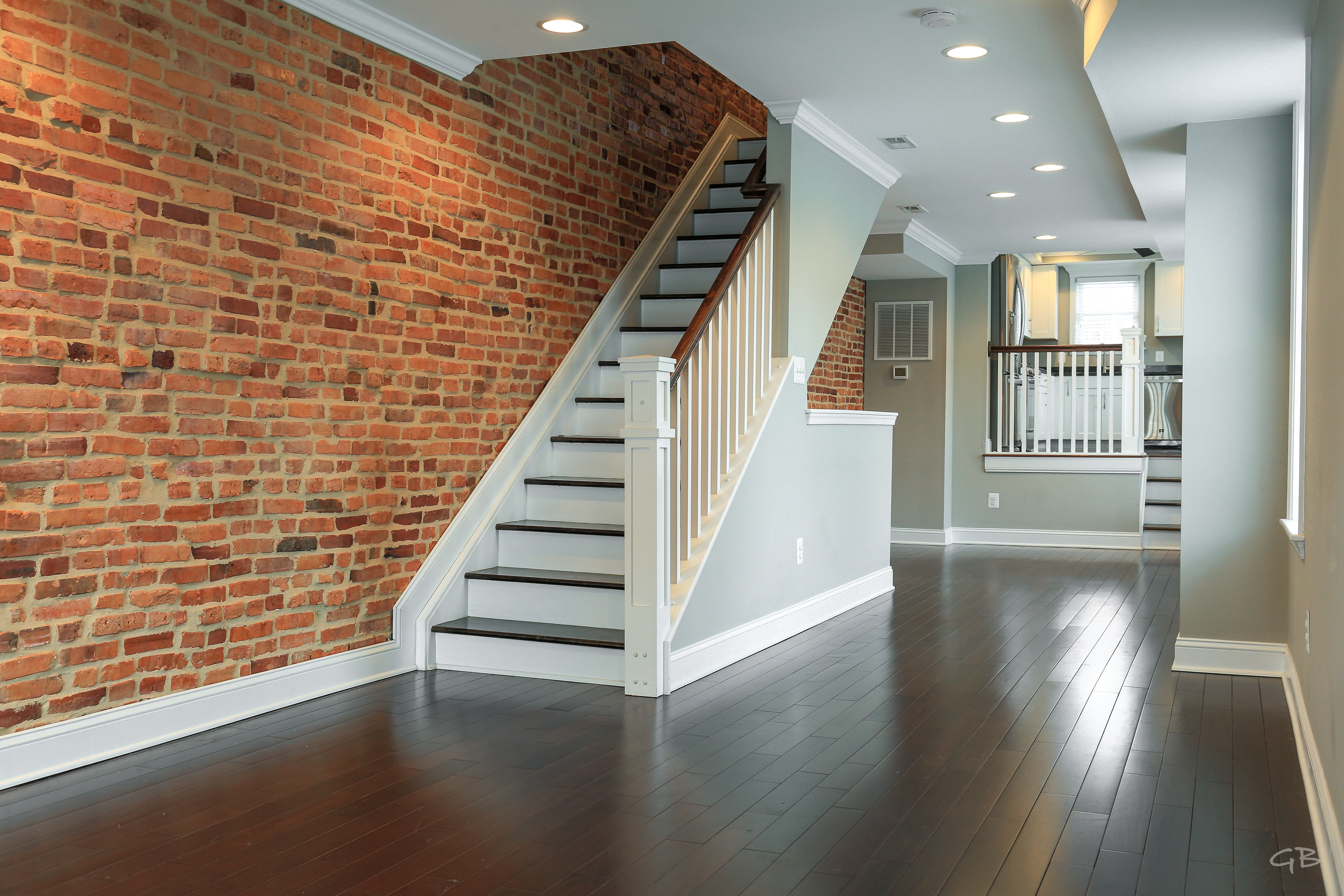
Rear Window Blinds at 45.

Sun is on the Opposite side of the House.
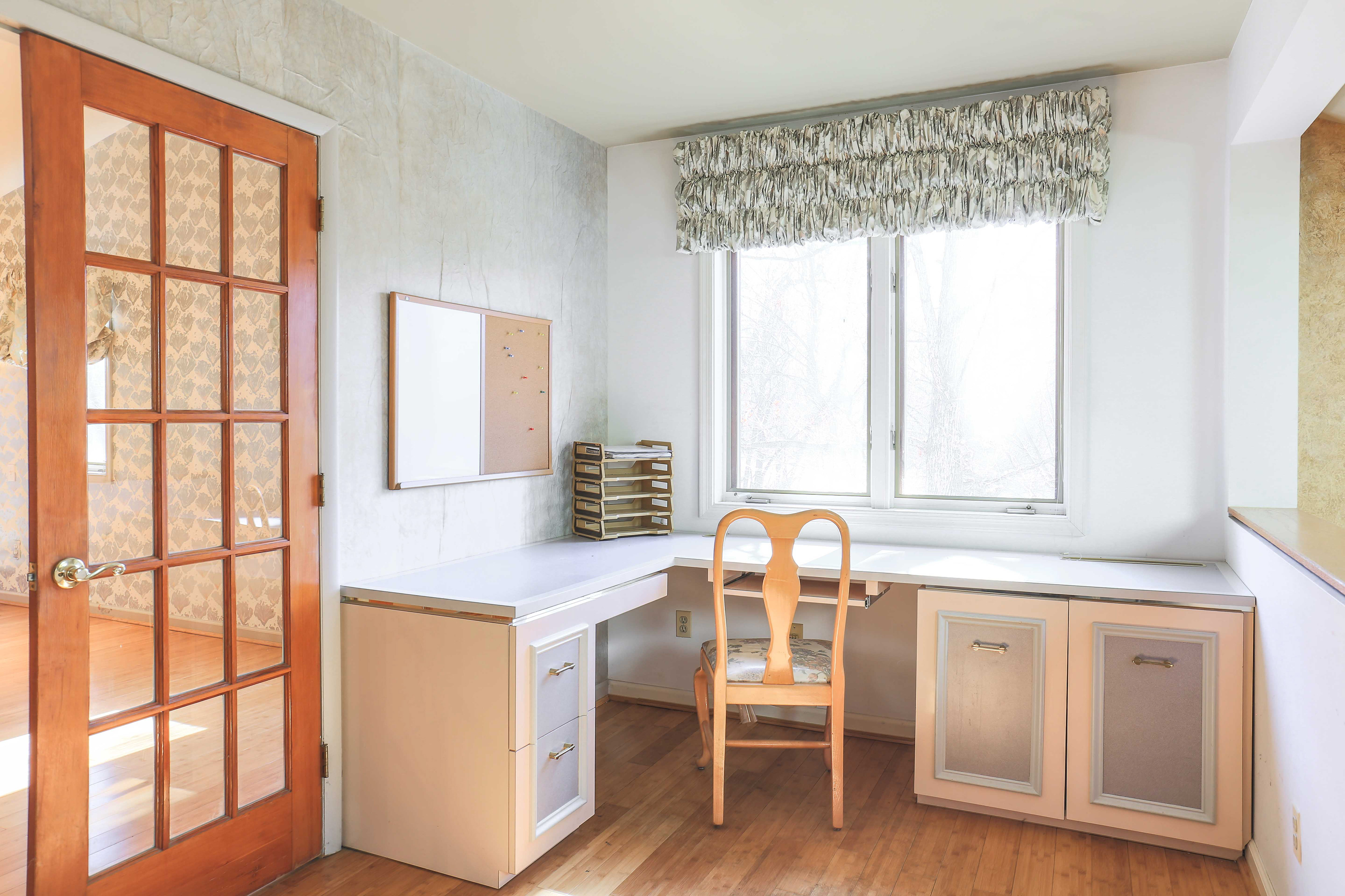
Windows Close to Being Blown Out.
Compare to Blown Out Shots I took Below.
Blown Out Windows. Ethereal Glow. Yet the Hotspot is Distracting.
3. Staging
Heard of Feng-Shui? Adding splashes of color to a home can make it feel alive and inviting. Feel free to play with any potted or faux plants to liven up each room. To make the property feel more spacious and free, you'll want to clear any excess items off of the countertops and windowsills - such as the giant bucket of utensils in the kitchen or the toothbrushes and air fresheners in the bathroom. Additionally, make sure to close the toilet seats - it looks cleaner - and put a full roll of TP on. It's amazing how the Psychology of seeing a full roll of toilet paper can subconsciously speak welcome & abundance!

See that Little Color Splash?
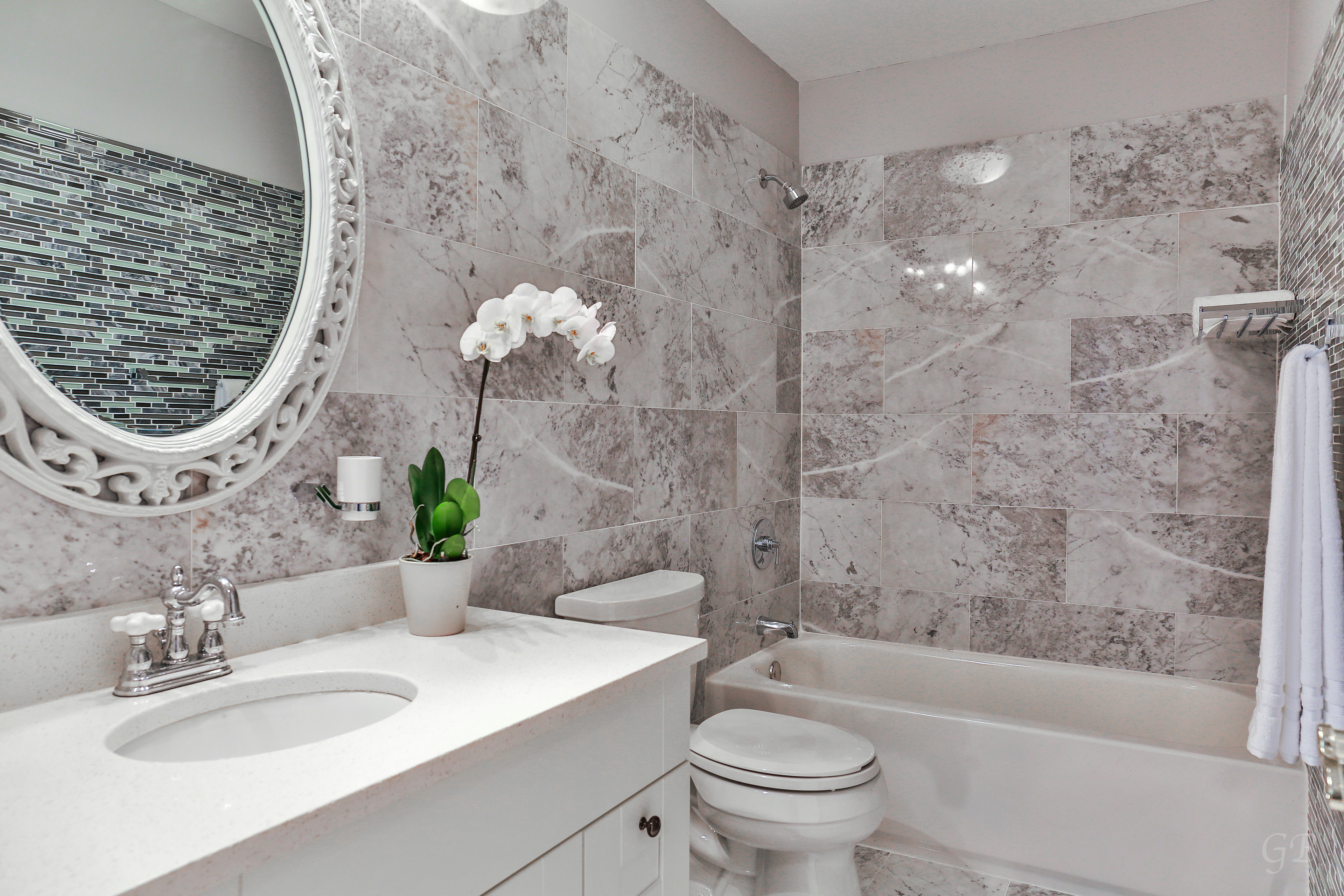
Same Faux Plant!
Clean Counters with a Simple Accent Color Splash.
4. Taking the Shot
You'll want to take the shots at approximately the same height in each room, with everything as level as possible. This way the vertical lines in the room will be straight up and down - not too much ceiling, nor too much floor, but just right. This creates a more immersive and pleasant flow from photo to photo as the potential buyers slide through in a seamless manner, just like a virtual walkthrough. Now, it's always best to use a tripod for stability and consistency, though new hand held smart phone photos can be pretty darn great these days. Thais said, no matter what equipment you choose to use, always make sure to shoot your images in 'landscape' format - wide, not tall ('portrait'). Wide angles are more pleasing and natural to the human eye, as well as they'll show off more of the room.
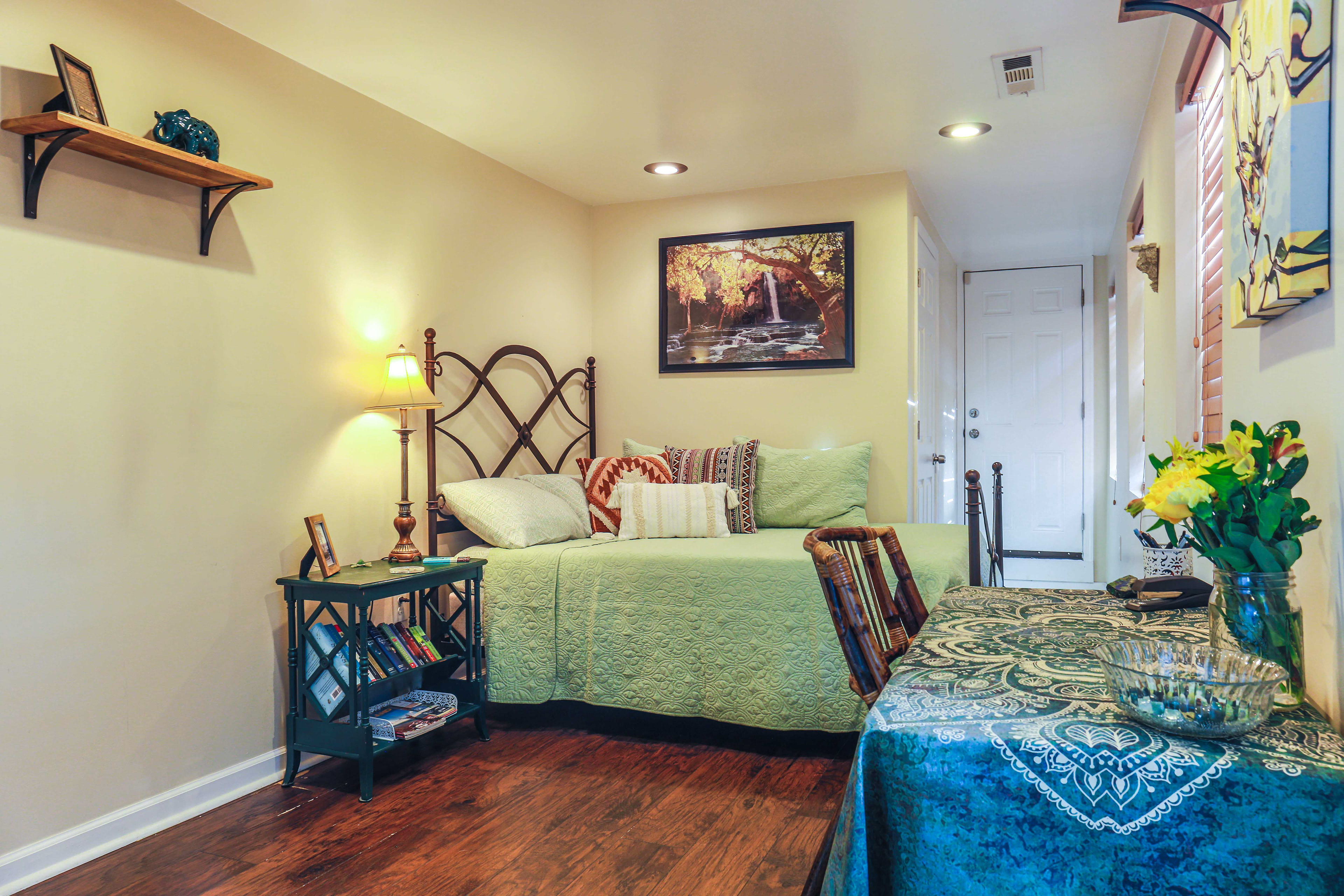
Maintain Level Shot & Verticals
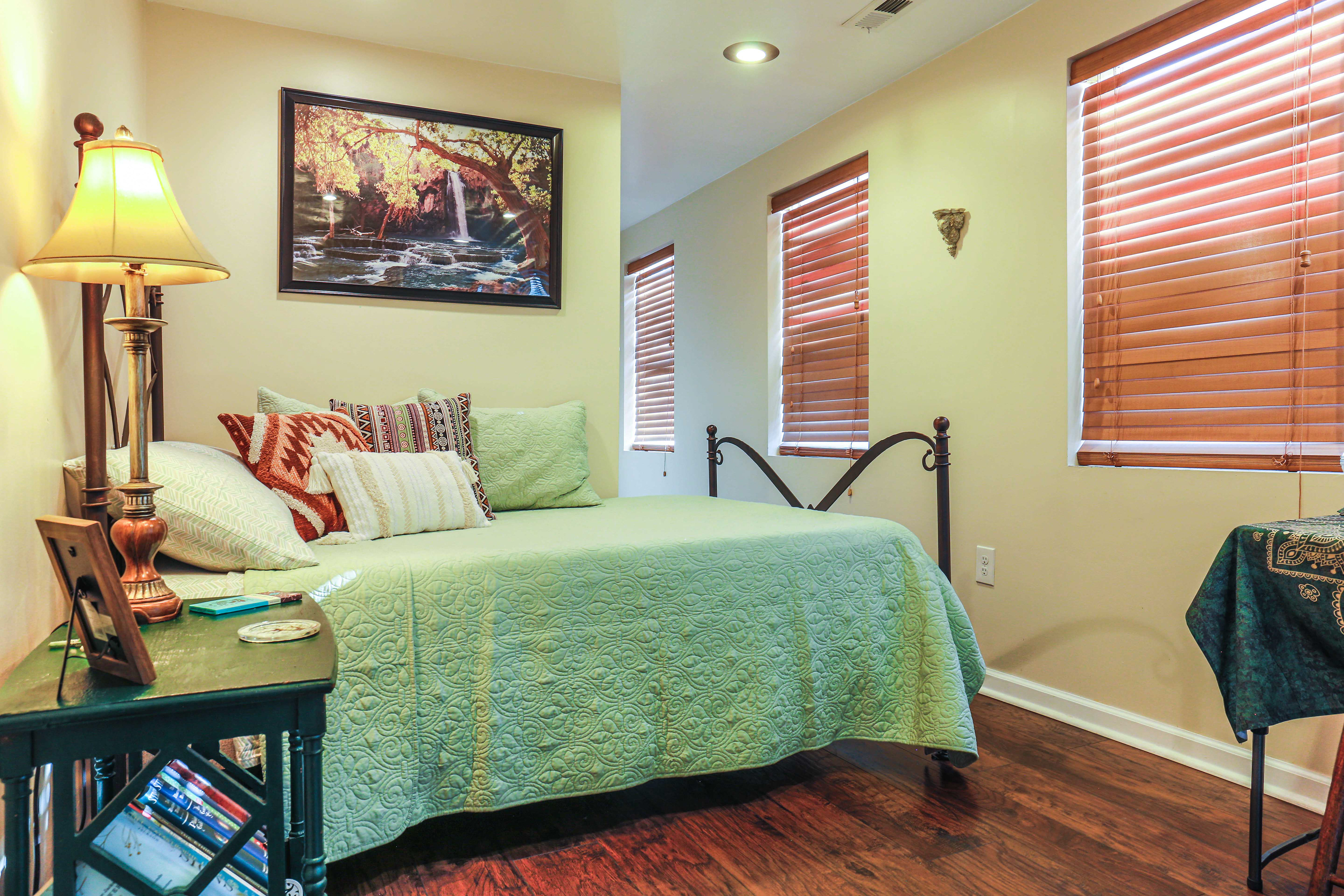
Fluid Transition from Shot to Shot
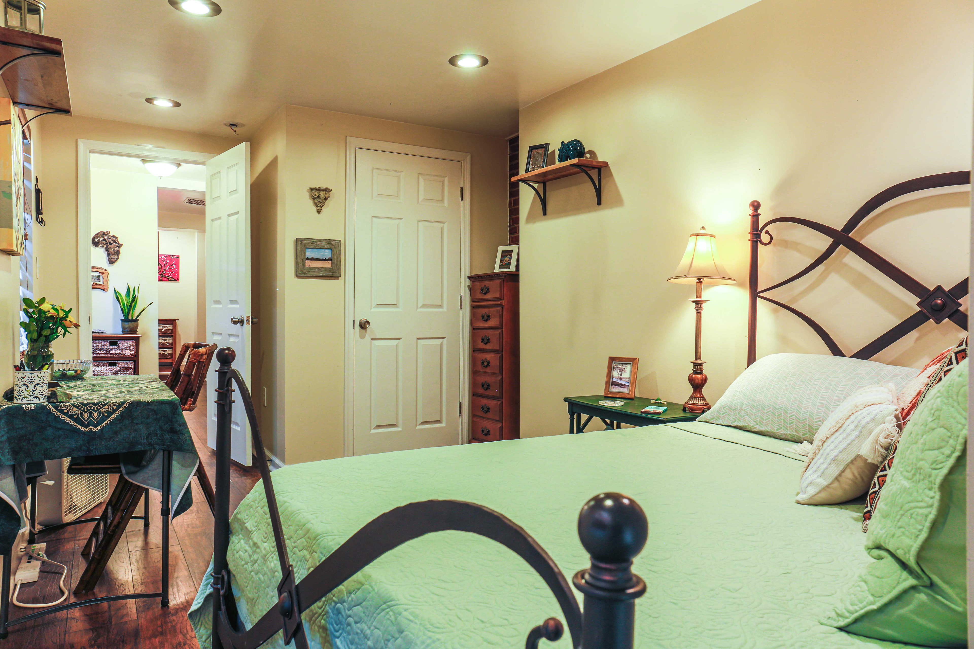
Capture Images At Same Height
5. Shooting Outside
Sometimes we work on others schedules, and our choices for the day & time of the shoot can be limited. It's all part of the job. So, just take a good look, when you arrive, at the exterior lighting of the property. Do the Shadows look 'Friendly'? Is the face of the house covered and foreboding or well lit and inviting? Maybe it makes more sense to shoot the Rear of the House First, then the inside, then the Front of the House after as the Sun has adjusted in the sky. These are a few things to consider. After all, these are typically the first images potential buyers see, the front of the house, so you'll want to make sure it stands out positively. If you can help it, I recommend not shooting on a heavily grey day for it can affect the vibrancy, liveliness, and colors of the final image. That said, a little remedy can be applied in post if the weather person got it wrong. Additionally, if you're shooting closer towards evening or dusk, make sure all the interior lights, plus the front porch lights, are on. It will enhance the warmth of the image plus add a lot of charm!
Which property below stands out to you most? Why? Focus on the surface lighting, richness of colors, & shadows. Where are your eyes pulled to & how welcomed do you feel?
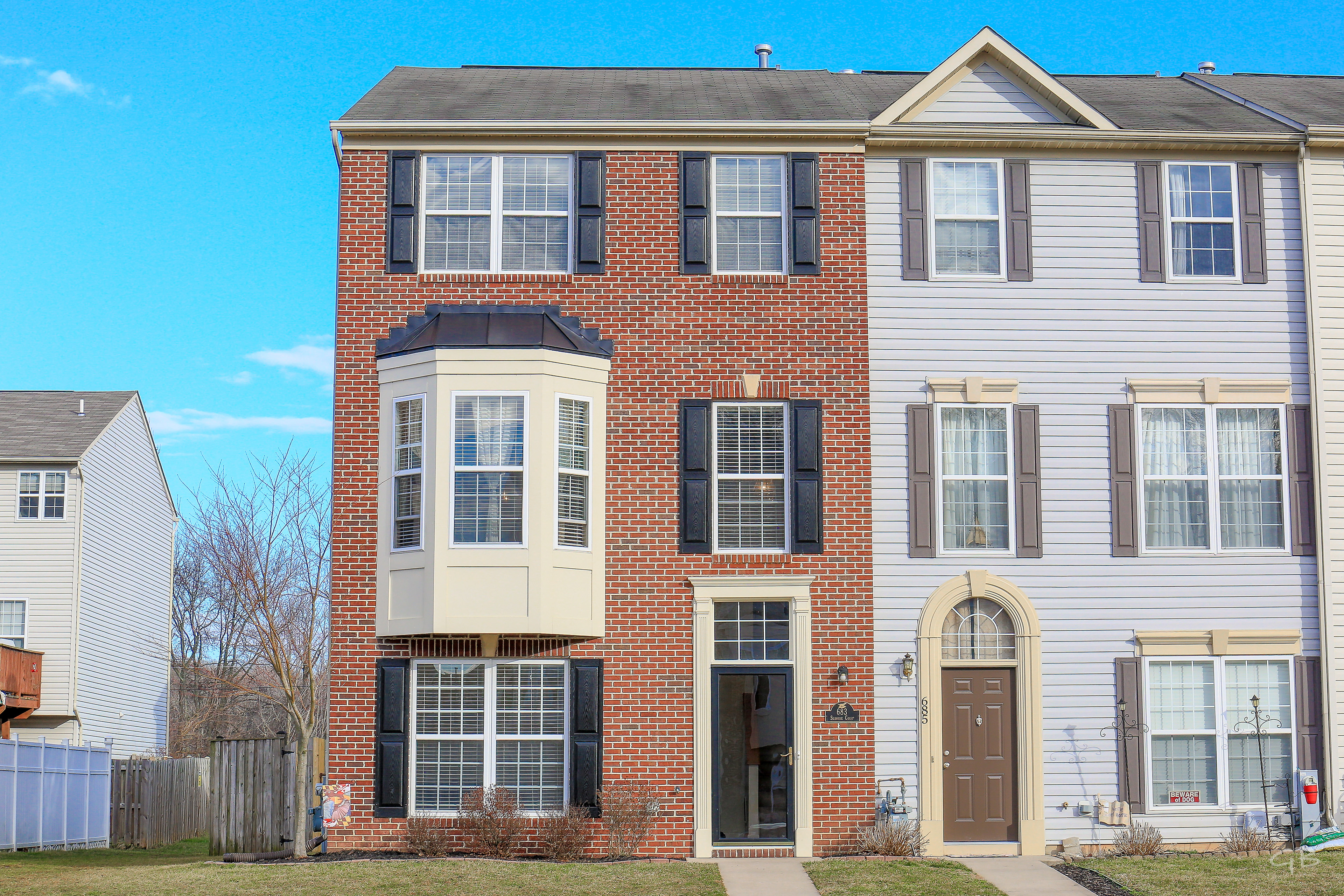
Morning Light. Front Lit.

Mid-Morning Light. Front Lit.
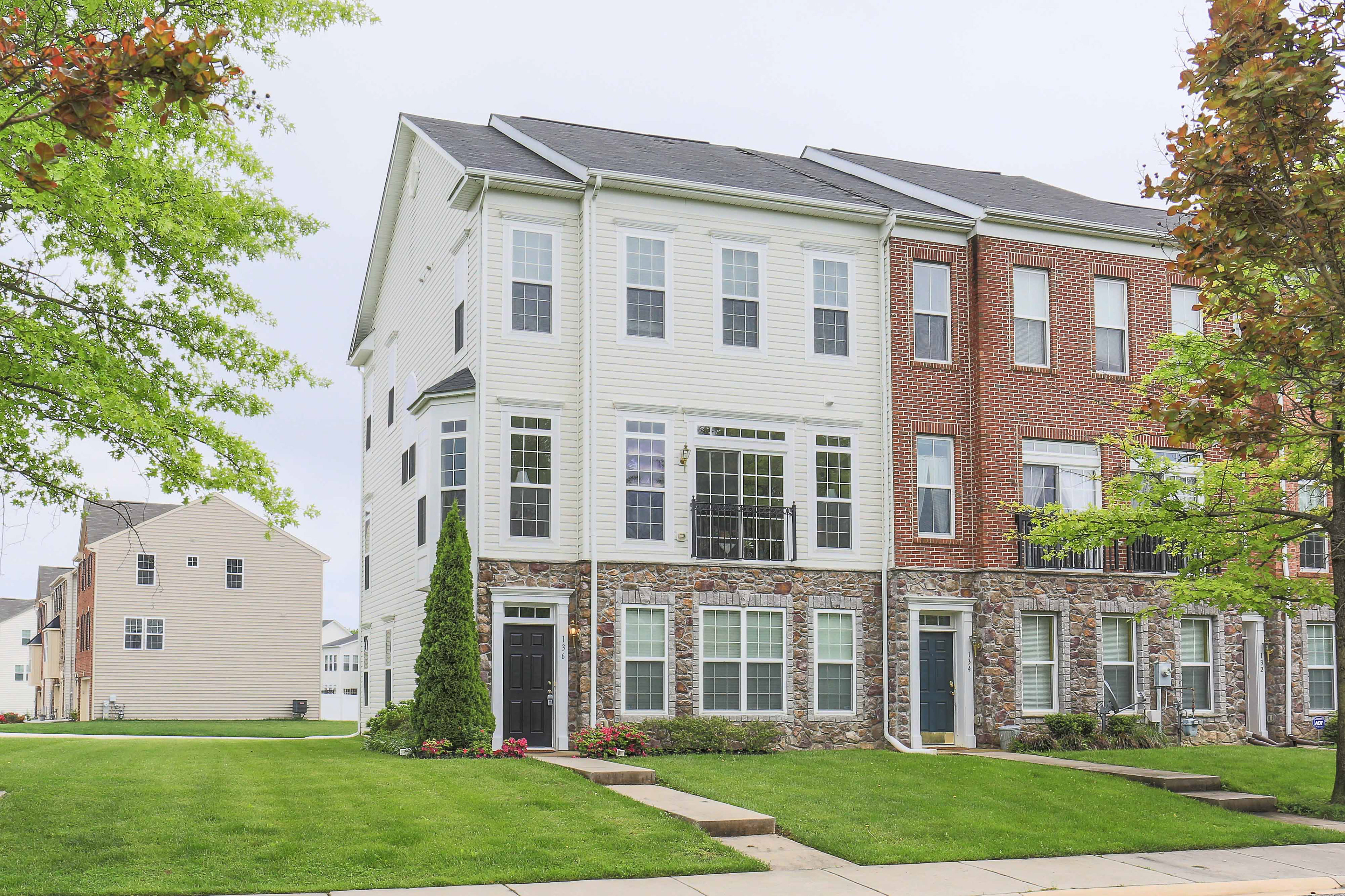
Cloudy Day. Soft Even Light.

Midday. Shadows Forming.

1PM. Heavy Shadows Forming.
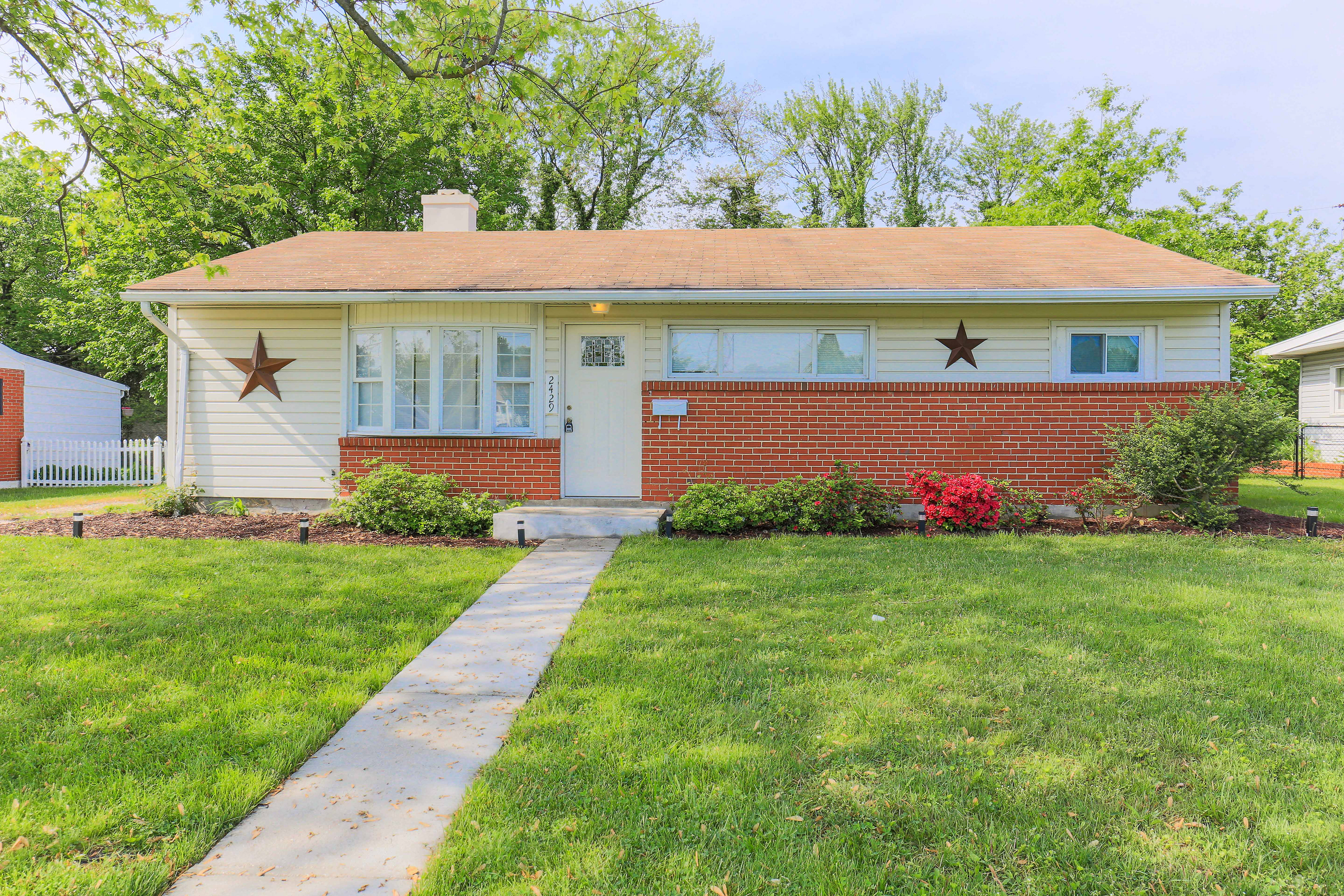
Sun on Opposite Side of House.
6. Final Touches
Editing can make a HUGE difference. Whether you're using your phone or a stand alone camera, something as simple as enhancing your images via a free editor can really assist you in making a 'bad' property look 'good', or a 'good' property look 'great'! By raising the Shadows and lowering the Highlights you can create a more evenly lit image. The Highlights will be Less 'Blown Out', and the Shadows will be less intense while still providing contrast.
Familiarize yourself with the free editor, on your phone or computer, to make fast simple tweaks, or feel free to download another editor app. The majority of the free or inexpensive ones are extremely user friendly, so don't fret, you'll master them in no time!
Note: All proFessional real estate photographers edit their images. It makes a huge difference.
There you have it! You have the means at your finger tips and you're ready to rock!
If you have any questions or concerns, please feel free to contact me right away. Even if you're not using my services, I'd love to assist you in anyway I can!
See the Difference
Compare My Photography with Another Professional Photographers.
*Note: The First Row images differ. The Left has new ceiling paint, fireplace shelving, & a hearthstone threshold.*
Alternating images: Theirs (o.P.P) | then Mine.

O.P.P. - White Washed w/ Flash.

Charming w/ Natural Light.

O.P.P. - Too Much Ceiling.

Even Ceiling & Floor Distribution.

O.P.P. - Odd Composition, Framing, & Angle.

Better Angle, Framing, & Composition.
Which do you prefer?
In the end, each style is just that, a style. There are as numerous styles as photographers.
I prefer natural, no flash, HDR (high dynamic range), photography. To me it's more colorful, charming, & inviting. My style is welcoming & meant to entice buyers through honesty & creativity. Instead of just point shooting, as I've seen some photographers who wrap up the shoot in under half an hour, I take my time, adding additional elements of intentionality into my design. If you Resonate with my Style, please let me know! I'll be happy to assist you with creating your newest top notch marketing material.
disclaimer: photographers are not Stagers and are not allowed to move items without Expressed consent of the owners and stagers. In addition to this, some homes when empty (or even full) just aren't visually appealing - you know what i'm talking about. In these cases, there's only so much a professional photographer can do to enhance the look of the property and highlight its charm. Additionally, my style is intended for Mid-Level Homes 1 Million & Under - that's my specialty. If you're looking to acquire photos for million-MultiMillion Plus Properties, that is a unique photography setup in itself, and you're looking for a photographer who specializes in that.
This information is intended for educational purposes only. Blessings.
